Recently, Duolingo's green owl has been crying non-stop, and before that, it would turn gray like it was "aging" or blurry like it was "sick," making users worry, “Is the app broken?” But it’s not a bug! It’s a cute reminder to study. Although not officially confirmed, users believe it’s a yearly tradition to honor discontinued language courses. It’ll return in about a week.
I’ve put together a blog post breaking down why the Duolingo icon sometimes looks sad, sick, when these changes happen, and how to fix it. With insights from Duolingo’s official 2025 icon update and feedback from 30+ users, let’s dive into the secrets behind the Duolingo owl icon!
Why Did Duolingo Design a Sad, Crying, Old, or Sick Icon?
The decision to create such unusual icons isn’t random—it serves several strategic purposes, making the Duolingo app icon look sad, crying, old, or sick key part of their strategy:
- Generating Buzz
A sad, crying, old, or sick Duolingo app icon is unexpected and quirky, naturally sparking curiosity and conversations online. This buzz increases user engagement as people discuss the changes on social media or search for explanations about why the Duolingo app icon looks sick, sad, old, or weird. - Creating Shared Experiences
These unusual designs foster a sense of community among users. Whether you’re laughing at the melting Duo or sympathizing with the sick or sad Duolingo app icon, these icons create shared moments that encourage people to connect over their language-learning journey. - Driving App Engagement
By making the Duolingo app icon look sad, crying, old, or sick, Duolingo ensures it stands out on your phone screen. This acts as a subtle nudge to open the app. Once you do, you’re more likely to resume your lessons—turning curiosity into action. - Seasonal or Thematic Tie-Ins
Some designs, like the melting Duo, align with specific events or themes, such as Halloween. Associating the sad, crying, old, or sick Duolingo app icon with fun and festive moments makes the app feel more engaging and relevant to users.
When Did Duolingo Change Its Logo to Look Sad, Crying, Old, or Sick?
Duolingo has made several notable changes to its app icon, each time leaning into a more unconventional and attention-grabbing design. These changes have made the Duolingo app icon look sick, sad, old, or weird, sparking discussions and keeping users engaged. Here’s a timeline of when Duolingo changed its logo to reflect these unique designs:
1.The Melting Icon Phase (October 2023)
In October 2023, Duolingo introduced a melting Duo icon, making the Duolingo app icon look weird and sick. This unexpected design aimed to create urgency, pushing users to open the app and continue learning. The melting Duo was both strange and fascinating, sparking curiosity and engagement.
2.The Exhausted Owl Update (April 2024)
By April 2024, Duolingo updated its icon to an exhausted Duo, making the Duolingo app icon look sad and old. This tired version of the owl reflected Duo’s fatigue from the brand’s marketing efforts, resonating with users who felt similarly overworked.
3.The Sick Owl Version (August 2024)
The latest update in August 2024 introduced a sick Duo icon, making the Duolingo app icon look sick and weird. With a runny nose and drooping eyes, this design continues Duolingo’s trend of quirky, attention-grabbing icons to keep users engaged and curious.
4.The Dead Duo (February 2025)
The "Dead Duo" design was one of the boldest, with crossed-out eyes, a sticking-out tongue, and the phrase "You killed Duo literally." It gave a fun twist to the usual learning process.
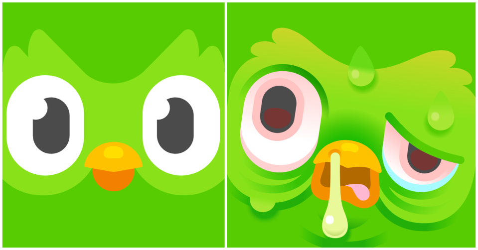
5.Crying Duo (September 2025)
In September 2025, Duo was crying non-stop. While not officially confirmed, users believe it's Duolingo's yearly tradition to honor discontinued courses. The icon will return to normal in about a week.
6.Christmas Duo
At Christmas, Duo sports a Santa hat and festive decorations like Christmas trees and snowflakes, creating a warm, cheerful vibe to keep users motivated through the holidays.
7.Halloween Duo
For Halloween, Duo transforms into spooky characters like ghosts or pumpkins, with eerie, glowing eyes to match the spooky season’s mood.
For Halloween, Duo transforms into spooky characters like ghosts or pumpkins, with eerie, glowing eyes to match the spooky season’s mood.
To learn more about the changes in Duolingo's icons, you can read: Why does my Duolingo icon look sick: a guide to different Duolingo app icons
How to Change My Duolingo App Icon
If you’re not a fan of the current sad, crying, old, or sick Duolingo app icon or simply want to personalize your experience, there are ways to change it. Whether you’re a premium user or looking for free solutions, here’s how you can replace the sad, crying, old, or sick Duolingo app icon with something more to your liking.
Icon Customization Options for Premium Users
Duolingo Super and Max subscribers can choose from themed app icons, offering a refreshing alternative to the sad, crying, old, or sick Duolingo app icon. Here’s how:
- Open the Duolingo app and tap on the Duo icon in the top right corner.
- Scroll down to find the “Super App Icon” or “Max App Icon” option.
- Toggle the switch to activate your preferred icon.
These premium icons feature vibrant and cheerful versions of Duo, letting you replace the sad, crying, old, or sick Duolingo app icon with something more personalized and fun.
If you’re not a premium user, consider joining Duolingo Family Plan , which costs just $9.99 per year. This affordable option gives you access to premium features, including custom app icons, making it a great way to replace the sick, sad, old, or weird Duolingo app icon without breaking the bank.
Ready to Save on Super Duolingo?
Join thousands of users already enjoying affordable access to Super Duolingo services through FamilyPro. Get started today!
How to Change My Duolingo App Icon for Free
For those who don’t have a premium subscription, there are free methods to change the sad, crying, old, or sick Duolingo app icon:
- Android Solutions: Many Android devices, like Samsung, offer built-in tools such as the “Wallpaper and Style” feature to modify app icons across your device. This lets you replace the sad, crying, old, or sick Duolingo app icon with a custom design.
- iOS Methods: On iPhones running iOS 14 or later, you can use the Shortcuts app to create custom icons for any app, including Duolingo.
By following these steps, you can easily replace the sad, crying, old, or sick Duolingo app icon with something that better suits your style and preferences. Whether you’re a premium user or exploring free options, customizing your Duolingo app icon is a great way to make your language-learning experience more enjoyable!